Of all the jobs I’ve done over the years, I thought telling people I was a book designer was pretty straightforward, like saying I was a cab driver or a hair stylist. Everybody would know what that was. Turns out that’s not the case.
Some people say: Oh, you design the book cover.
Sometimes, I respond. But often someone else does the cover and I design the interior layout.
That’s when I see a shimmer of confusion cross their face: what is there to design? I imagine they’re thinking.
We’re all used to opening up our word processing program and starting to type. Someone has already made decisions about the page dimensions, margins, typeface & size, leading, paragraph indents [or not], spaces before or after paragraphs [or not], page numbers, running heads and footers, and a myriad of other design elements. That word-processed document could be printed out and bound, but what you would have is a bound manuscript, not a designed book.
A book designer starts afresh with all those decisions, taking into consideration the book’s purpose, content, intended audience, the various text & graphic elements to be accommodated on the page, their relative importance and relationship to one another, as well as issues related to the final product: how many copies will be printed? by what process? how will it be bound? will it have a full color interior? black & white? some combination of the two? how will it be distributed? how will reorders be handled?
Book design is one of those jobs that, when done well, is pretty much invisible. But when it’s done poorly, it causes the reader irritation, and confusion which usually reflects back on the book’s author.
My APH colleague Linda Coffin of HistoryCrafters gives a compelling example:
“…the design and production of a book are vitally important to the impact that book will have on its readers. There are many compelling, important and well-written stories that go unread simply because they look amateurish or even downright bad. Most people are unaware of how a good design can be a vital communication tool, telling its own story about the narrative and the narrator.
Too often design is treated as just window-dressing (“this isn’t about a pretty design, it’s about the story!”). Of course the story is the whole purpose of creating the book. But it will be even more effective and more compelling if it’s well-designed and well-produced. The two things simply must go hand-in-hand if we want to do justice to the story.
A recent project is a case in point. My client’s family was unhappy with his narrative, telling him that he hadn’t put enough emotion into it and that it was boring to read. But now I’ve redesigned the layout and given them a sample of the first chapter. The narrative flows in a clearly readable form. The photos are sharp and crisp and sitting next to the text they illustrate. The chapter and topic divisions now make sense. The headers and footers are correct and help guide you through the story. Guess what? Suddenly his family is thrilled. ‘Wow, Dad, this is great stuff,’ said the same son who had complained that there was no emotion in it. Same client, same material, same story, but much better design and production. All the difference in the world.”
And now, as books take on another incarnation as e-books [something I think of as a simply a metaphor, no more a book than a television show is a stage production], even more issues—design and technical—arise. But that’s a post for another day.
_____
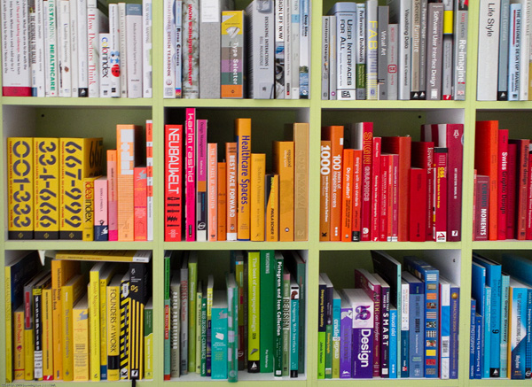
Image by See-ming Lee ??? SML / SML under a Creative Commons license
