Like book design in general, typography is noticed more in its misapplication than when it is well-chosen and well-set. Typography is far more than just picking a font face and size and getting on with it. It’s an artisan’s craft, particularly suited to those who are mildly to moderately obsessive about the tiniest elements: hanging punctuation anyone?
I’m a firm believer in getting a good grounding in the fundamental elements of any craft or trade. Through the long history of setting type—from cast metal through phototypesetting to digital fonts—principles have evolved that affect legibility and readability as well as the reader’s emotional and aesthetic response. The following three books provide a good foundation for understanding this 500+ year old craft.
A note on publication dates: When I look at books about technology or training books for specific programs, I always look for something published within the past year or two. However, when it comes to design and typography, principles don’t change with the software versions. So I tend to look to the classics, written by people well established in their field.
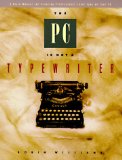
Back in the days of Hemingway and Dorothy Parker, writers didn’t need to know anything about setting type: that was handled for them. Today there’s a generation of a certain age that grew up using typewriters but are now writing with computers and, in many cases, expected to be their own typesetters. In 1990 Robin Williams [the writer, not the actor, but almost as funny] wrote her wonderful little book: The PC is not a Typewriter. [Williams has also written a version for the Mac called, appropriately enough, The Mac is not a Typewriter so Mac people do not have to go through the trouble of translating function keys.]
By now, it seems, everyone has heard about one space after punctuation, not two, although some still resist or are uneasy about it. Williams explains why the rule you learned in high school typing circa 1967 is no longer relevant. She then moves on to distinguish the appropriate use of en and em dashes, how to find and use special characters and glyphs that might be buried in your font’s character set, and how to set paragraphs that would make Maxwell Perkins weep for joy at the beauty of it all.
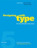
Designing with Type by James Craig has been a required text in almost all college courses on typography since 1971. Most recently updated in 2006, eliminating rubber cement and thinner from the list of “essential tools for the designer” [I assume, since the copy on my bookshelf was revised in 1980], it is the equivalent of a semester or two at an excellent design school.
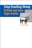
First published in 1993 and revised in 2002, Stop Stealing Sheep is a more entertaining and somewhat less intimidating book that covers much of the same ground as Craig’s book but less pedantically. It is also a wonderful exemplar of various type applications: pay particular attention to the indexes, credits, chapter titles and sidebars.
You might be interested in some of my other book recommendations on my resources for learning page.
