This is an update of a post from 08 October 2009.
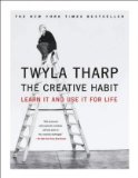
In part 1 of this post, I used Twyla Tharp’s book The Creative Habit as a model for looking at a book through designer eyes, identifying and articulating the various graphic elements that combine to create the reader’s experience of the content.
Despite identifying eight different elements to consider, we never even began talking about type, even though “what font should I use?” is often the first question non-designers ask. So in this post we’ll look at some of the typographic elements used in the book.
The main variables involving type in a book are typeface, size [including leading], color, and case. [Weights and styles—bold, extra bold, semibold italic, etc—are a subset of typeface that can add finer divisions of content hierarchy but, if used promiscuously, will simply confuse the reader.]
Typophiles might have immediately identified the typefaces used in this book as Bodoini and Franklin Gothic. I like to work my way through identifont.com because it forces me to look at the tiniest element of a font’s design and thus imprints it more permanently on my brain.
In my previous post I pointed out the color choices the designer* made—black, red, and shades of gray. In addition there is also white, or paper, reversed out of a black or gray box.
And type can be set in various cases: normal, all caps, small caps, no caps.
So looking at pages 2-7, here are some of the main paragraph and character styles I see there:
• Chapter number: Bodoni 12, black, normal [upper & lower] case
• Chapter title: Bodoni 56 black and gray, all lower case
I would call the gray a character style, applied to a few words in the Chapter Title.
The position of both of these type elements changes from chapter to chapter. This is a book about creativity after all seen through the lens of a choreographer, who uses movement and position in space as expressive elements. Some chapter titles are set larger [chapter 10] and some smaller [chapter 5]. Had he made only one chapter a different type size, we might think that was a mistake; by doing more than one, it signals a deliberate design choice.
• Lead-in paragraph: Also Bodoni, gray, variable type size and leading, taking up at least 3/4 of the vertical distance but again not completely consistent or predictable. A red character style is applied to the first few words.
• Body text: Bodoni 12/18 black justified paragraphs with hyphenation. Another red 16/18 character style [e.g., p 7] used for emphasis.
• Running head Tharp: Bodoni 8 red normal case on right page only
• Running head chapter: Franklin 7 or 8 [different fonts will have different cap heights] black set all lowercase
If you keep reading, you will see that there are more paragraph and character styles used throughout the body text. I have a number of future posts planned around the topic of styles, but for now, consider it a conceptual exercise, giving every different use of type variables—typeface, color, size, case—a distinct name, defining its characteristics, and specifying its usage rules.
Want some homework? In part 1, we identified different page types, among them exercise pages and creative biography pages. In addition to the colored background used to signal these pages, there is a shift in typography as well. Look at the exercises beginning on page 29 and identify the paragraph and character styles used throughout this section. Do the same thing for the black box or creative autobiography pages beginning on 45 and continuing on 54.
Meanwhile, keep your eyes open—and read like a designer!
—————————–
*Julian Peploe designed both the book and the cover for The Creative Habit.
—————————–
Related posts you might like:
reading a book like a designer-part 1
