This is an update of a post from 01 October 2009.
Of course, we book designers read books like regular people. But, when we are in “design mode”, we look at a book in a different way. We’re not so much interested in specific content as we are in identifying how many different elements of content there are and how those elements relate to one another.
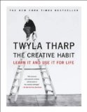
In a previous post on The Creative Habit by Twyla Tharp, I pointed out some of the elements that were used in an interesting way. Let’s expand a bit on that here, using her book as a point of reference.
page size and format
This is a decision the book designer makes early on. It then constrains other design options and often has a big impact on printing and binding costs. A common size for trade paperback books is 6×9 inches; Tharp’s is 7×9. I do not presume to speak to the underlying reasoning of the book designer*, but I am immediately drawn to books that are different, particularly books about art and creativity that trend toward more square, less rectangular. This is very often a subconscious reaction.
binding
This is a paperback book, often referred to as “perfect bound”. It lies relatively flat when opened, something paperbacks often do not do. This is due in part, no doubt, to the wider page size as well as to the particular binding method itself, sometimes referred to as “fan binding”.
color
This is a two-color printing job: black and red. Black is also used as a screen or tint [less than 100% ink coverage], giving the designer a range of gray values to work with. Notice that on some pages the ink “bleeds”. That means it extends all the way to the edge of the paper; you’ll notice it when you look at the paper edges with the book closed.
Using bleeds might increase production costs. The designer sets up for the bleed to extend beyond the trim edges—usually by 1/8“ all around—and that may require a larger sheet of paper or running the job on a larger printing press or digital output device.
[For a faux bleed treatment, take a look at pages from Wisdom. Sorry, no preview pages available, but it’s easy to spot in a bookstore: 12×12 with the fabulous Clint Eastwood on the cover.]
margins & columns
Relatively narrow and equal inside and out: 0.75”, same for the bottom and 0.50“ for the top. This yields a fairly long line length when set in one column, and that becomes one of the variables in the choice of type size and leading. [Are you beginning to see how everything is related?]
page types
How many different types of pages are there? Looking through Chapter One, this is how I would identify them:
- chapter opening spread – two pages starting on a verso [left] page
- chapter intro – one page starting on a verso
- chapter text
- chapter text with graphics
- pp 20-21, 26-27 – what do you think? are these distinct types of pages, or just another graphic? your call.
- exercise pages – one or more, can start on recto [right] or verso
- black box pages or ”creative biography“ pages – see page 45
What about the front matter? Title page, publication information page, etc? And the back matter? How many different types of pages would you identify here?
graphic elements
What graphic elements are used throughout the book? Photos? illustrations? What graphics came from outside sources? Where and how are they acknowledged? Are there instances where the type itself becomes a graphic element? What is this conveying to the reader?
page numbers, headers and footers
How are page numbers handled? Where are they placed? Are there pages without page numbers? Which ones? Why? Is information repeated as a header or footer? What information? On which pages?
cover
Deconstructing cover design is a subject for another series of posts [and probably calls for someone with far more expertise in that aspect of design than I have], but for now, just consider how the cover relates to the interior design in terms of the elements listed above. [Fun fact: in traditional publishing, cover design is often done separately from the interior design, with no interaction between the two designers. Tharp’s book had the same designer* for both.]
For extra credit, try to identify all the different elements that go into the design of the cover. [Hint: a lot of them are on the back—and don’t forget the spine.]
There are a number of resources on the web that can take you inside the mind of the cover designer. Here’s one to get you started—George Foster. I like his website for the before and after analysis he provides.
The more you can break these elements apart and articulate each one, the more tools you have at your disposal for developing an effective book design. And we haven’t even begun to talk about what font to use, have we?
If you want to work ahead into what I’ll be covering in the next post—type choices—identify the type faces used in Tharp’s book. Maybe you’re a crackerjack font identifier; I like to go to identifont.com and work through their questions. You’ll start to learn the nuances of type face design. [If you don’t have the book, there are preview pages on amazon.com]
Til next time–happy reading!
—————————–
*Julian Peploe designed both the book and the cover for The Creative Habit.
—————————–
Related posts you might like:
reading a book like a designer – part 2
the creative habit by twyla tharp
—————————–
