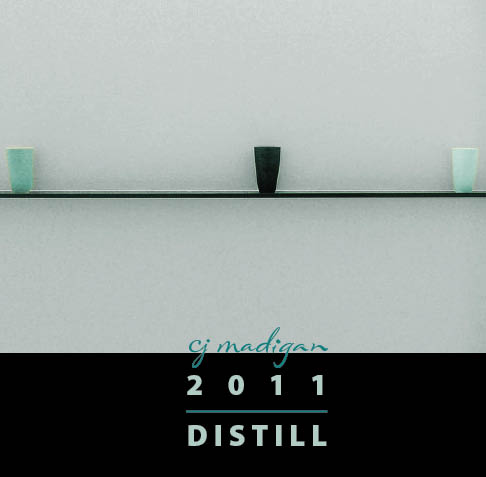
Since Thanksgiving, I’ve been working on a personal book project that I’m referring to as my 2011 Inspiration Book.
Over the years I have developed pages of material based on various strategic planning systems: year end summaries, goal setting, etc. They have always been written as a business document in Word, printed out on 8.5×11-inch sheets of paper and put in a file folder or slipped into page protectors in a three-ring binder. I realized this year that I was becoming more and more averse to going anywhere near this material. Rather than providing guidance and inspiration, it was soul-deadening. It wasn’t so much the content of the material, but the way it was presented.
So I decided to create a book out of the material, adapting some of the ideas in Lisa Sonoma Beam’s The Creative Entrepreneur, but using the medium of print-on-demand books.
Here, to the best of my recollection, I recount my rambling journey to create this book. Perhaps it will serve as a cautionary tale; perhaps as reassurance about your own process. It’s messy work, this creativity thing; particularly where it intersects technology. [I use the term create here rather than design deliberately. When I develop a book design for others, the constraints are usually set and I have no control over the content or sequence of text and images. They are givens. With my own books, everything is subject to alteration. “This is not necessarily a good thing,” she says ruefully.]
setting constraints
I love constraints; they eliminate so much from the universe of infinite possibilities. They begin to give a wee bit of definition to the problem I am trying to solve.
- My 2011 Inspiration Book will be a 7×7 softcover from blurb. I like the square proportion and the small size will sit unobtrusively on my desk, subliminally reminding me of the path I am setting out on for the year. It’s also easy to toss in my bag and carry with me.
- Because I expect to be revising and reprinting this book many times in the coming year—it’s intended to be a living, working document, just like when it was in .doc format—cost is an issue. The 7×7 softcover is the least expensive option blurb has if I keep the page count to no more than 40 pages. [Actually, I get only 39 of those pages because blurb reserves the last page for its own logo, unless I pay an extra, per book fee. I usually do this for client books, but for this book I’ve chosen not to.]
- The images need to come from my personal collection or from flickr’s creative commons domain because I have allocated no budget to buy rights to new images.
- And while I don’t intend this book to become commercial, I want to leave myself the option of using the images in other ways that might be considered commercial, so my creative commons search is further restricted to images offered for commercial use.
laying out the dummy
Working in InDesign, I block out the fixed pages: 1 title page, 2 publication information page, 3 table of contents page. I like to use the final left hand page of a book for a strong image that encapsulates the sense of the entire book, but since that page is not available to me, I block out the spread on pages 38-39 for that purpose.
Then I place various chunks of text to see how they lay out on the remaining pages. I want to determine what text should be on a two-page spread and what should stand alone.
This led me to discover there are natural breaks that could serve as section dividers. Since I want these dividers to be two-page spreads, I needed to go back and adjust some of the text blocks.
gathering images & placing them in the layout
This is the work of what used to be called a photo editor. Since there isn’t a narrative in my written material, it is images [and color] that will drive the book. Rather than having literal meaning, they need to invoke a certain emotional or visceral response. The images themselves, their relationship to one another, and the sequence in which they are presented are crucial.
I spend two evenings searching for images from my own library, from flickr’s creative commons, and—just in case—creating an istockphoto lightbox. Then another two or three putting them together with the words to see how the sequence works. Sometimes I have great images, but their colors clashed. Or the image is perfect but its orientation or proportion won’t fit my page size the way I want. And sometimes an image that by itself I love just doesn’t seem to belong in this book.
At this point, everything is fluid. Because it’s all my text, and it’s more phrases and bullet points than narrative anyway, it can be separated and rearranged and recombined to suit the imagery. In some cases, I rewrite the material to make it work better.
adjusting and adapting the images
I finally wrestle the images and the text into a coherent conceptual and visual flow but now it’s color that is giving me grief. My solution is to first create a consistent underlying palette for the entire book – background color, text color, emphasis color. Then I desaturate all the images and tone them with one of the colors from the palette. Ahhh. It’s looking good.
back up and redo
Now I’m feeling rather satisfied, perhaps even letting a wee bit of pride show itself. But then two new thoughts occur to me:
- while the images look great on my computer monitor, I didn’t pay attention to the resolution of the creative commons images; they may not be large enough to print well.
- even more troubling, I realize that after I altered the color of the images, I may not have license to do so. Now I need to go back image by image and verify that the permissions include the right to “modify, adapt, or build upon.” This should have been articulated as one of my constraints from the beginning.
So, that’s where I am today. So, what have your experiences been creating and designing books? Books for clients, your own traditional books, even artists books. Do you have a process you follow every time, or do you find yourself wandering in the wilderness more than occasionally, circling and backtracking and having to tear down what you thought was permanent to start all over again? I’d love to hear from you.
Related posts you might like:
why making a book is hard—and fun!
Cover image by +fatman+ via flickr used under a Creative Commons License
