In a previous post I wrote about stumbling blocks to watch out for in your workflow. Today I want to write from the positive side: what you can do to make your workflow go more smoothly with less wasted effort and, most importantly, less chance of making silly errors.
1. Use styles.
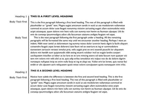
Styles have been a feature of Microsoft Word for as long as I can remember. Yet I rarely encounter anyone who uses them. Honestly, they will make your life so much easier! Styles are a set of formatting commands that apply to different types of text in a document—level 1 heading, level 2 heading, body text, bullet text, etc. You apply a style to paragraphs [or characters], then define the formatting elements of the style. [Or vice versa], If you later decide, for example, that your level 1 heading should be Helvetica rather than Garamond, you simply change the style definition and all the paragraphs tagged with that style are changed at once. Styles from Word integrate with styles in InDesign.
2. Use colors to validate styles.
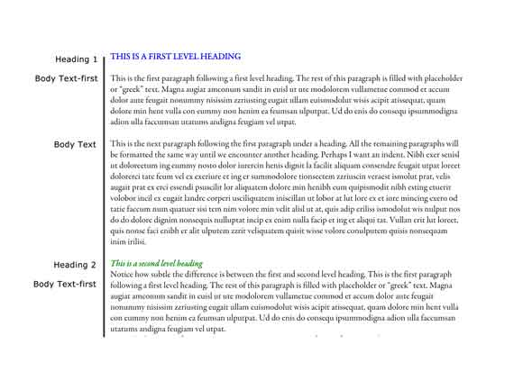
Make things easy on yourself and use color to quickly highlight any problem areas. Once you have set up styles, while you are still in the “construction” phase, apply a color to the style. [It doesn’t need to stay there – this is just part of your quality control process.] Often heading levels have subtle distinctions and it’s not always easy to spot them when they are all in black type. I do this when I get a manuscript and there are multiple heading levels with subtle distinctions. [And because my client doesn’t use styles, they are often inconsistent themselves in how they format the headings.] By tagging Heading 1 blue, Heading 2 green, Heading 3 violet, it’s much easier for my client to look at the manuscript – or just a table of contents extract – and say, no, this one should be heading 2 and that one should be heading 3.
3. Set up a project folder template.
All my book design projects have the same types of elements: text files, image files, layout files, review files, and administrative files. So I have set up a template folder that I can quickly copy and rename for a particular project, ready for me to fill with the particular files associated with that project.
4. Develop a file naming scheme—and use it consistently.
I use a prefix with my client’s initials, project number, project name, and then a suffix with the version number. Version 0 is always the initial design version; the 0 indicates that this is not a file to be carried forward as it often does not have current versions of the text or images.
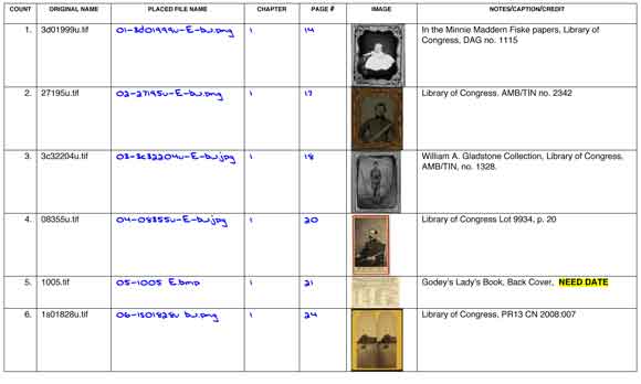
Regardless of what filenames my clients may have given the image files, I add a prefix so they present in the order in which they will be placed in the book. So my client’s original image [obtained from the U.S. Library of Congress] was named 1s01828u.tif. I added the prefix 006- to indicate it’s the 6th image to be placed in the book. [Because there will be over 100 images, I use leading zeros so they display in order.] As I work through the image enhancement process, I add the suffixes –E [enhanced] and –bw [converted to grayscale]. After enhancing and converting I save it in its ready-to-place .png format. So the new file name is 006-1s01828u-E-bw.png.
5. Use colors to navigate more quickly to the current file.
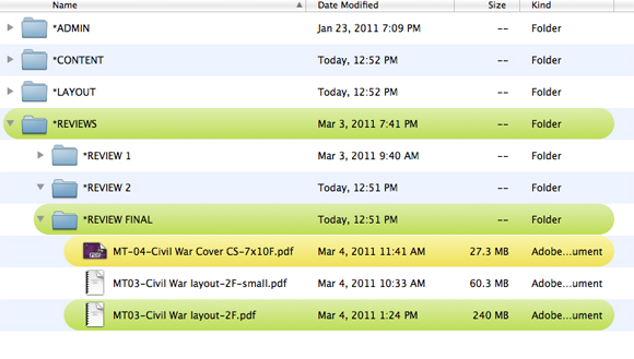
In the midst of a project it is easy to mistakenly open the wrong file. Use your operating system’s ability to apply color to files and folders so you have a path to follow to make sure you select the current version of the file.
6. Set up headers/footers and slugs.
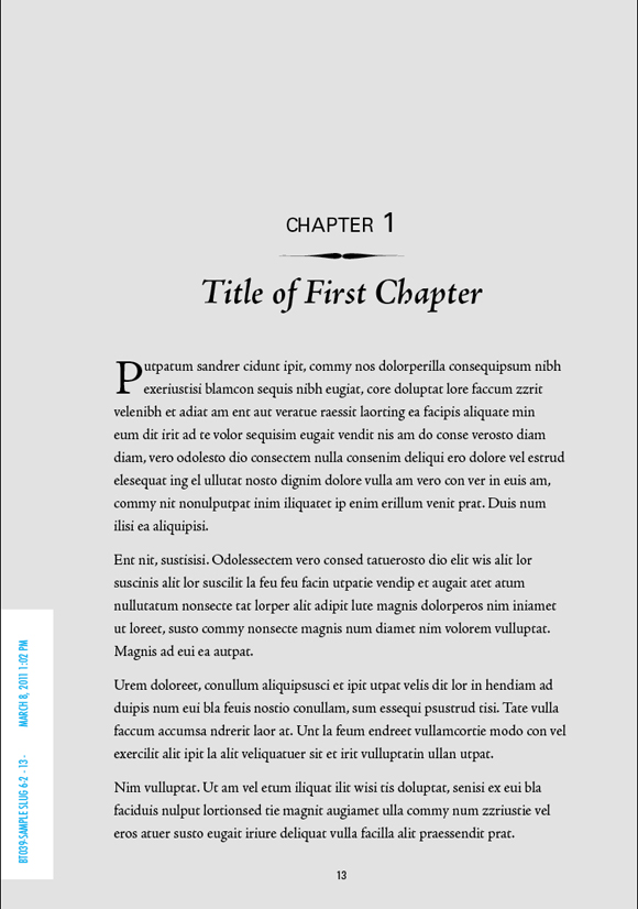
After two or three rounds of revisions involving two or three or more reviewers, it’s almost inevitable that someone is going to open or print out the wrong file version. Use headers or footers in Word or a slug placed in the gutter in InDesign with text variables that update automatically to show the file name, page number, and latest save date. Emphasize the difference between versions by applying a different color to each new version.
7. Use checklists.
The books I work on usually involved a lot of photos and it’s easy to lose track of which photos are ready to place, which still need work, which are unusable, etc. But with a checklist, I can work through the photos systematically with a minimum of fuss because I can see where I left off and what is yet to be done.
There are many other types of checklists that I use on various projects and there most certainly are checklists I haven’t yet thought about yet.
One of my mantras is “think once, execute many times.” By spending a little time up front to develop systems, procedures, and forms, a lot of the confusion and frustration caused by administrative mix-ups is eliminated and we are free to concentrate on the more interesting and rewarding work we love as book designers.
I’d love to hear about your tips for managing a complex workload. Please leave a note in the comments section.
Examples used are from a recent project with Maureen Taylor, The Photo Detective, and her upcoming book Finding The
Civil War in Your Family Album.


